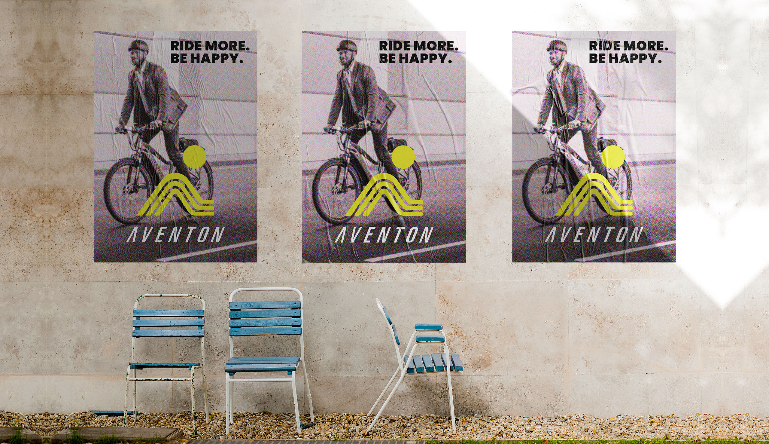
Aventon is an e-bike brand that gives you the freedom to go where you want, do what you want, and be who you want. Own your power and move freely.
MAKE IT SMALLER
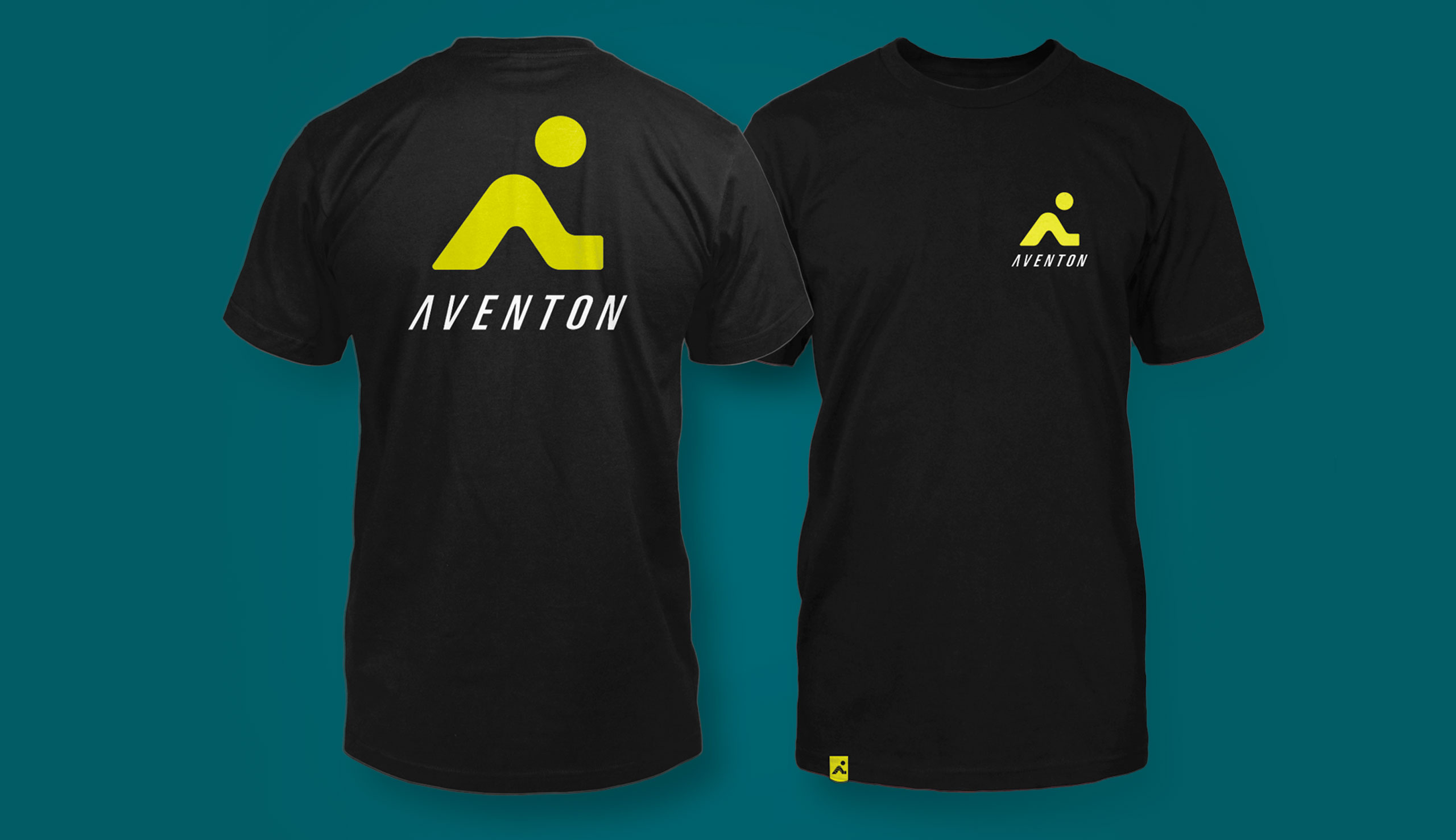
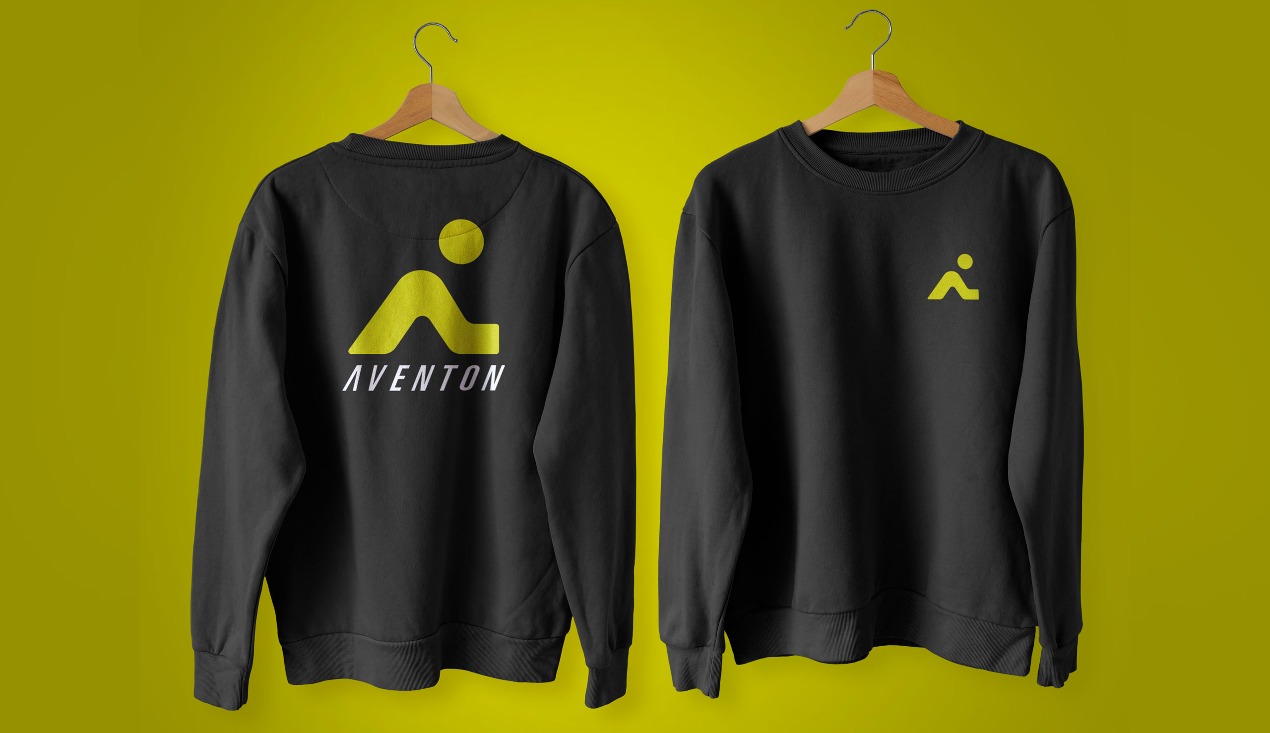
As Aventon expanded their business, they realized the importance of having a logo symbol that could represent their brand identity with just a single mark. Sometimes, using the full logotype wasn’t practical. That’s where a logomark came in handy, allowing them to incorporate their branding in more creative and diverse ways.
IS THIS SMALL ENOUGH
As Aventon expanded their business, they realized the importance of having a logo symbol that could represent their brand identity with just a single mark. Sometimes, using the full logotype wasn’t practical. That’s where a logomark came in handy, allowing them to incorporate their branding in more creative and diverse ways.
Here is some of the work I developed for AVENTON
Brand design, illustration, product design and everything in between.
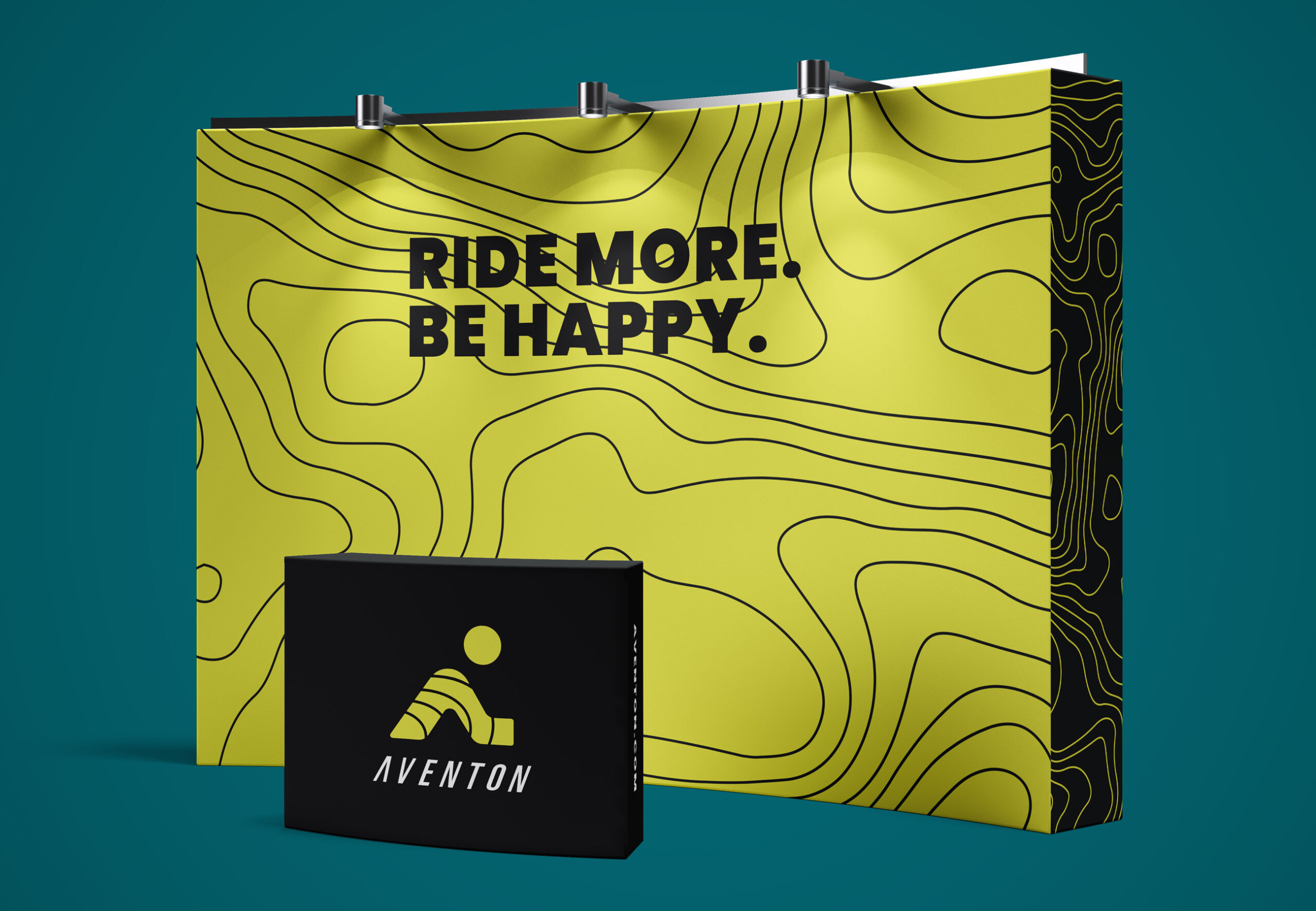
WHEN GOING SMALL GOES BIG
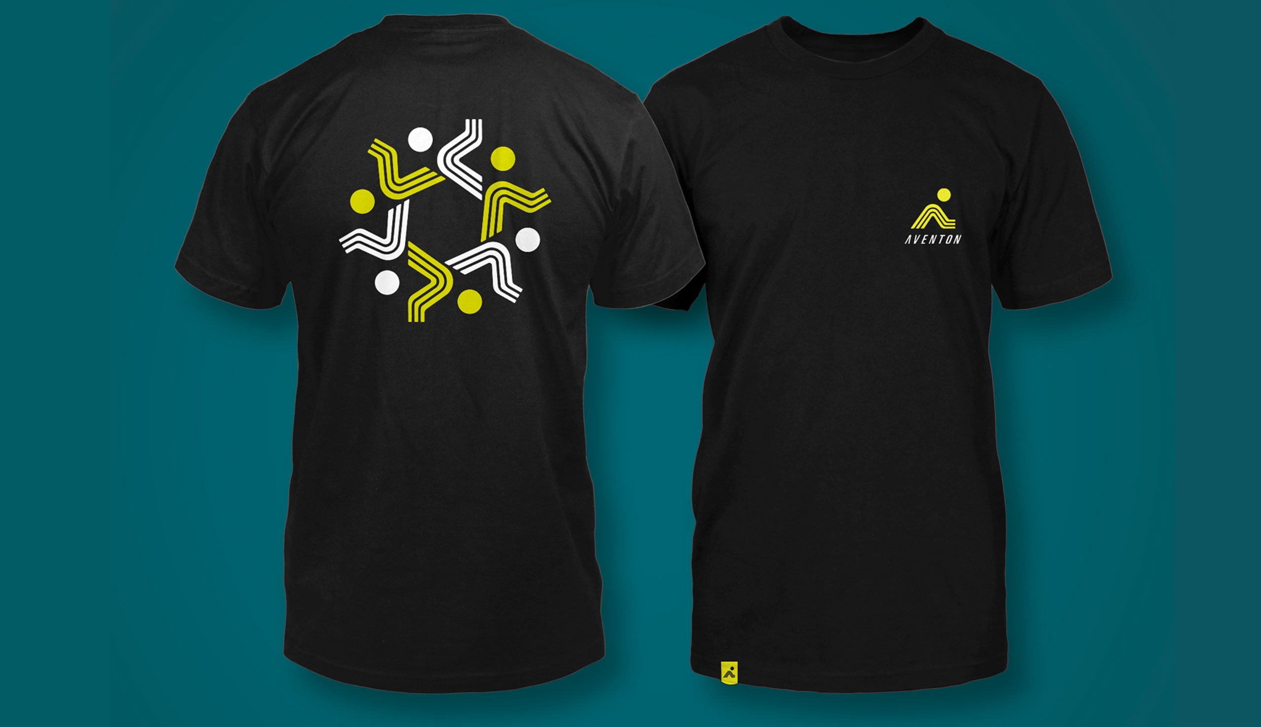
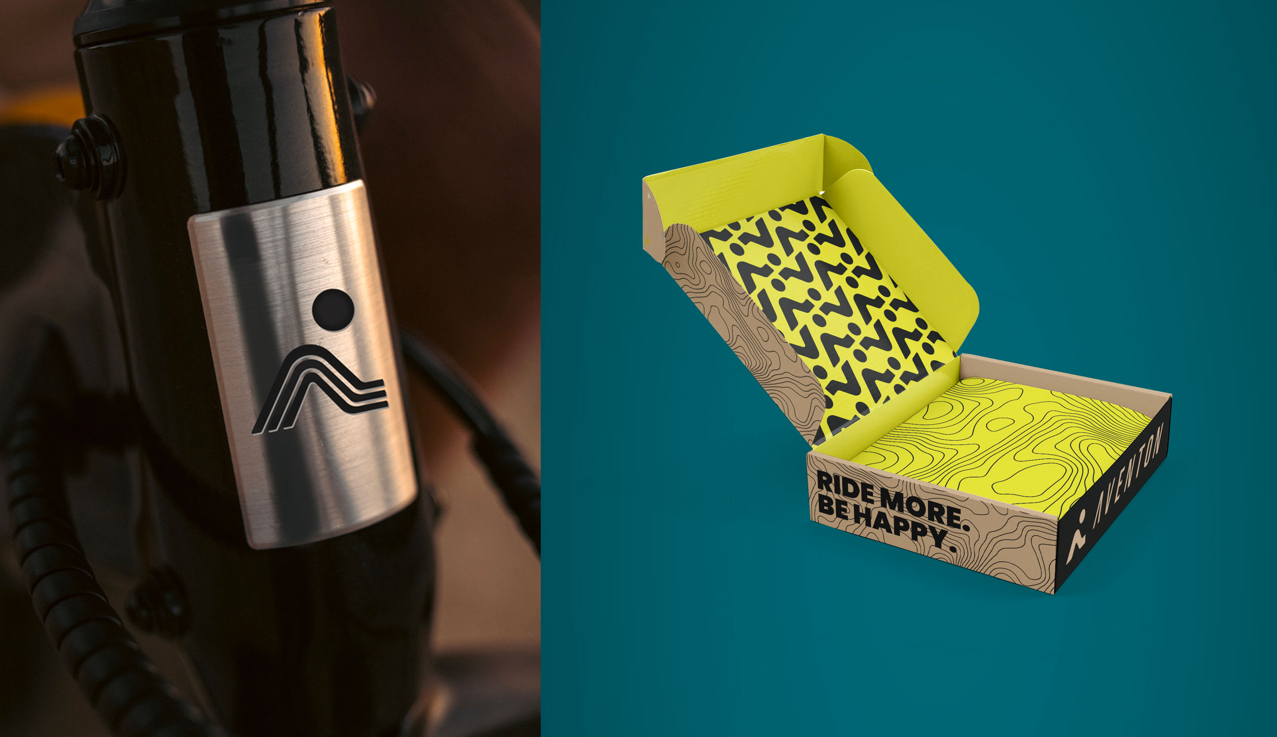
Having a logomark that can serve as a brand symbol has allowed Aventon to expand it’s product offerings, while keeping things on brand. The logomark that has been developed will be able to brand the widest range of products now and far into the future. With Aventon’s new logomark the product and branding possibilities are endless.
